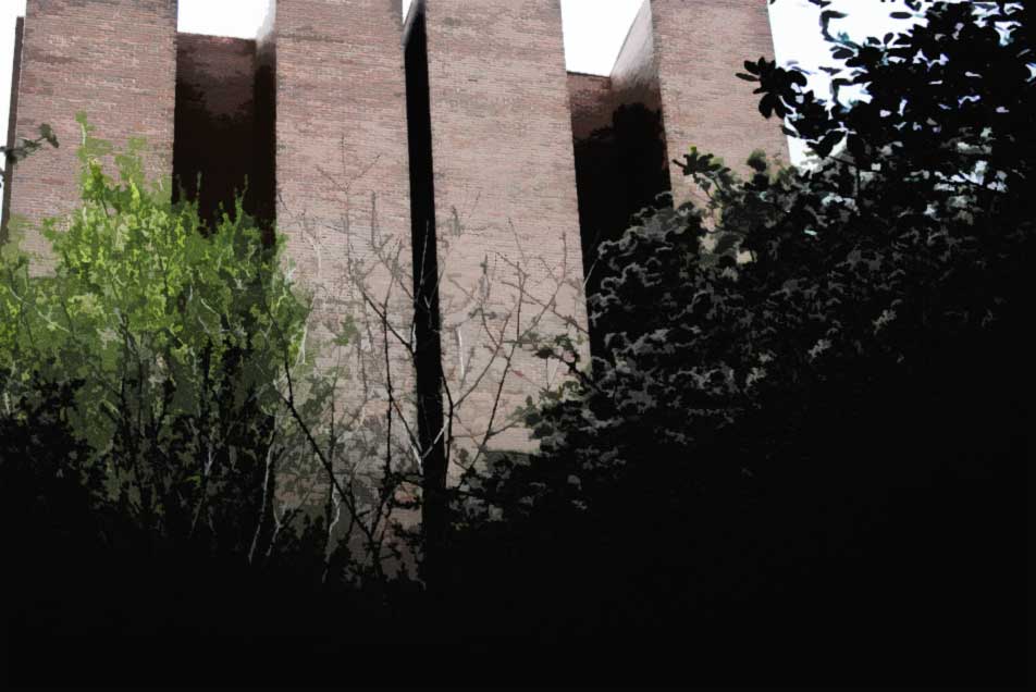
From the outside, Barnard College’s newly opened Diana student center looks benign. Designed by architects Weiss and Manfredi to replace the school’s previous MacIntosh student union, a zealous exercise in 1960’s-style raw concrete, the new building’s contextually sensitive materials and proportions mark a successful return to the visual unity of the old campus. While the center’s facade panels, for example, were fabricated from thoroughly modern metal construction, their familiar red color selection enables the debutante Diana to smoothly relate to the ivy-draped brick of her more traditional elder neighbors. Once the daytime festivities conclude, the glass and steel of that facade can also perform a kaleidescope of visual skits in response to the glistening of the setting sun.
The elegance with which the Diana’s exterior manages to balance between the past and future becomes even more appreciable upon comparison with Columbia University’s own controversial attempt at the same facade problem across the street. Bernard Tschumi’s Columbia student center, Lerner Hall, was intended, like the Diana, to reinvigorate its community with contemporary resources while intertwining with its historic surroundings. Although Tschumi’s vision started out as the bolder of the two, with its glass campus-side facade of criss-crossing catwalks intended to elevate mundane student life to theatrical levels, the plan’s audacity soon turned into the source of its own downfall. A series of community complaints reduced the glass footage on Lerner’s street facade in favor of more contextual stone and brick elements. That revival of traditional architectural values also re-awakened another less pleasant University tradition; Lerner’s fortified street wall continues the Columbia past-time of turning a hard stone face to its surrounding community. The Diana, in comparison, attempts to connect its student life to the activity of the city outside by placing glass windows at the level of the sidewalk.

- Columbia University’s Lerner Hall takes a defensive, traditional approach to its urban context.

- Once the sidewalk outside Barnard’s campus re-opens, it will allow students in the Diana Center cafe to people watch while they eat.
Similar rivers of glass also run along the campus side of the Diana’s facade, carrying with them more than a subtle whiff of the exterior stairways in Alvar Aalto’s MIT Baker House. The intent, according to the Diana’s architects, was to create a porous, flowing structure. According to architect Marion Weiss in an interview on the Barnard website, “We want to encourage what I call peripheral vision, or accidental encounters, the cross-fertilization of disciplines that makes the liberal arts experience unique. By creating long sight-lines through several stories we hope that students will look up from their coffee and become intrigued by their colleagues’ work in other parts of the building.” Those intentions, while noble, do not play out as successfully in reality; several of the busiest communal spaces are detached from the building’s view corridors. Cost-cutting sounds like a plausible cause, along with security issues; I was disappointed to find that the building’s drawing and architecture studios, for example, are sealed off from visitors in a manner than could discourage collaboration between the arts.

Back on the ground, the Diana’s landscaping moves are more successful at uniting the campus. Where her MacIntosh predecessor blundered in front of the elegant courtyard of nearby Milbank Hall, the Diana’s massing gracefully defers to the campus’s older visual axis in order to make room for a restored walkway across the school. Tiered greenery adorns the path.

Another open space will take a more contemporary approach, if you know where to find it. It’s going to be a green roof. It’s not open yet, but hopefully it will be by the time the outdoor temperature increases enough for students to comfortably venture up there.

Once you walk inside, however, the Diana forgets her manners. Although the lobby initially greets you with a sympathetic gesture of human-scale proportions, the performance immediately stumbles on a raucous material selection note. For what is meant to be the community center of a small close-knit womens’ college, bare concrete and life-preserver orange do not make for a welcoming reception.


The circles try to help. It’s a familiar design trick; from the contemporary VW Beetle to the iPod, the circle has been tapped countless times for its nature as a basic, primal symbol capable of inspiring the most instinctive levels of emotion. And here the round furniture’s cheerful shapes and loose configurations do manage to provide some lonely respite for the eyes amidst the surrounding tyranny of gray.
As soon as you turn your head away from those stools, however, their comforting atmosphere is shattered. Apart from some token paint jobs, every space is a world of gray. The walls are hard glass. The ceilings are a clinical white. The light fixtures look like icicles. Squeals and screeches echo in your head. And the concrete is applied liberally, everywhere, in flat sheets, without care or tact. You might as well be studying inside a throbbing cement mixer drum. In the interior spaces where students will actively eat and work and socialize, the Diana reopens the very same brutalist wounds that its conception as a building project sought to smooth over.
And those concrete spaces don’t just look uncomfortable. They could also be a safety issue. The floors are slick. Granted, I initially found it fun to slide along the concrete when nobody was watching. But I was also wearing sneakers. What will happen on more formal occasions, when an illustrious guest speaker or a powerful alumna donor attempts to teeter across the slippery floor in high heels? The next time a reception or a reunion rolls around Barnard might wish to keep an ambulance, and a team of lawyers, close at hand.
Despite those drawbacks, it’s not hard to see how the Diana’s materials decisions happened. Barnard understandably wanted its new student center to speak to the modern era while also reinvigorating the college’s community life. Exposed concrete, at its best, could have fit that bill; it has a venerable history of appearing in buildings that were both honest and progressive. In the hands of the right architect, that modern material could even become passionate or civilized.
Louis Kahn’s Yale Center for British Art, for example, gracefully balances the cool concrete of its structural bones with inlays of refined woodwork. The overall impression is that you have been miraculously invited into a lord’s elegant drawing room.

Kahn's concrete is both refined and odd. Photograph by Flickr user David Gale Studios, used under Creative Commons.
Approaching Le Corbusier’s masterpiece at Ronchamp, where concrete is molded into paleolithic sculptural shapes, leads to a more emotional vision of the material’s humane potential. The church’s primal form trembles in response to the surrounding hill, immediately signaling that you have entered a sacred site. It feels like the kind of place where you might suddenly behold a column of witch doctors streaming out of the dark forest around you with their torches raised high, to gather and chant for the summoning of Gaia.

Le Corbusier's Ronchamp chapel will forever be mysterious. Photograph by Flickr user scarletgreen, licensed under Creative Commons.
The Diana’s concrete, however, does not rise to such occasions. The empty, clanging Barnard student center just looks like some place where you would go to play basketball.


Was that really Barnard’s intended atmosphere? The answer can be found in the campus’s many nooks and crannies where concerned whispers and gossip might begin to emerge. There you can find an older architectural voice that would be outraged by the contemporary insurrections of the Diana, yet it speaks with tact and grace.
It speaks of a forgotten time of elegance and craftsmanship …

… and the play of light and shadow …
… and it makes you wonder; are those footsteps echoing behind you just the sound of another student, or could they be a ghost?

By simultaneously conveying both a quaint, comfortable atmosphere and a more exciting sense of wonder and mystery, the older Barnard campus buildings provide an effective cultural match for a small womens’ college situated amidst the faster-paced resources of New York City. The new Diana, on the other hand, ignores its campus’s spiritual imperative in order to race after more contemporary design trends without taking the time to consider how, or if, they should be applied.
The school’s leadership could have found inspiration for an alternative philosophical approach surprisingly close to home; before coming to New York, Barnard President Debora Spar was previously involved with the Harvard Business School, where architect Robert A.M. Stern infamously won several building commissions by promising to style his designs in accordance with what he termed Harvard’s “branding.” The campus’s architecture, he argued, was to be approached as a part of the larger comprehensive image and philosophy of the school. Although Stern capitalized on the concept of branding to convince Harvard to adopt his preferred traditional architectural approach, the basic idea that a building should reflect the principles that its client stands for could also apply to other styles and institutions. Harvard built with chronological dishonesty in order to become more philosophically honest to itself.

One of Stern's commissions for the Harvard Business School. Photograph by Flickr user eszter, used under Creative Commons.
While it is always ill-advised for any organization operating in the 21st century to imitate the styles of the past, a similar analytical process to Stern’s could have served as an inspiration for Barnard to create a more responsive design informed by the results of genuine architectural soul searching. Unless, of course, the Diana’s cold personality was actually intentional all along.