Student Centers: Separated at Birth?

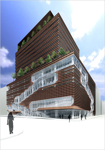
Rendering by SOM via the NY Times
Upon beholding Skidmore, Owings, and Merill‘s rendering of their recently unveiled $353 million design for the New School’s new student center, I noticed that its design looked oddly familiar to another building which I recently reviewed….

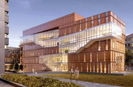
Rendering by Weiss/Manfredi, since I don't have a picture of this view of the completed building handy on my laptop.
Weiss and Manfredi‘s Barnard College Diana Center. Her construction was completed earlier this year.
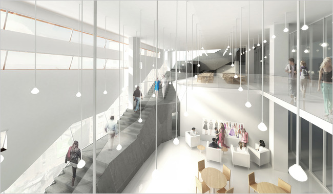
Both buildings are collegiate student centers designed to combine academic activities and student life. Both of their facades use warm metal cladding, punctuated by cascades of glass, to connect said campus life to their larger surrounding city. Both buildings strive to gain further brownie points through their attempts at green roofs. And the bright SOM interior, flowing across multiple levels of space, also seems more familiar than its modernity would suggest.

Another SOM rendering, also via the NY Times.
Admittedly, the New School proposal does exhibit some distinctive features, such as the 9-story, 600-room dormitory perched on top of its offending student center wing. But despite those differences in size and program, the two specimens are looking oddly similar to each other…
Thanks to Mariya Meshcheryakova for the tip!


